VQR’s Minor Redesign
VQR underwent its first-ever redesign five years ago, and after twenty issues, we’re updating the design a bit. Our Winter 2009 issue will be the first issue sporting the new look. It’s slimmer and brighter, but has as much packed inside as always.
The first change you’ll notice is our logo. We’ve moved away from the segmented |V|Q|R| motif and switched to something a bit bolder. Here’s how it appears on the winter issue:
As with the old logo, the color will change each month to reflect the cover art and the feel that we want to evoke.
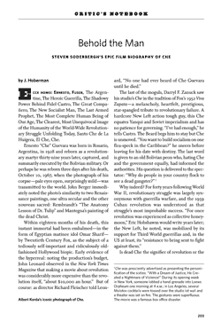
You’ll find the second change once you thumb through the pages—we’ve gone to a two-column layout. Here’s the opening page to J. Hoberman’s “Behold the Man: Steven Soderbergh’s Epic Film Biography of Che”:
Dual columns are arguably easier on the reader’s eye, but more important is that they allow other design changes that, in turn, allow us to save paper. We’ve tightened up the kerning and the leading, and decreased the margins a bit. Those changes would have made the pages harder to read with a single-column format, but they work just fine with this new look. Each page of VQR now has approximately 750 words, rather than the 450 that we’ve been limited to.
The Winter 2009 issue has the highest word count of any issue in the past year, but it will look like the briefest in a half-decade. We’re saving on paper, printing costs, shipping costs, storage space, and of course money with this new design. Look for the Winter 2009 issue in your mailbox and on newsstands around January 1.


